Melding Art and Life
According to modernist critics, art—whether painting, sculpture, poetry, or music—was meant to engender a particular kind of aesthetic experience, which some characterized as spiritual or mystical, that took the viewer out of the humdrum of everyday existence and, through contemplation, offered a momentary glimpse of something beyond our imperfect world. These critics, and the artists they valorized, did not necessarily think that art should be apolitical; in fact, they thought that the only way art could respond to the world was by maintaining some distance from it, hence the emphasis on art as an “autonomous sphere.”
However, artists of the late 1950s and early 1960s rejected this call for autonomy, advocating instead that art needed to get down into the muck of everyday life in order to remain relevant. Their motivations for doing so were mixed: some artists wanted to use quotidian objects or behaviors in their work to make the everyday unfamiliar and strange, as a way of commenting on the ideologies that structure our experiences and make them seem natural. Other artists celebrated the everyday, wanting to elevate the banalities and oddities of daily life to a sphere that had been traditionally reserved for magnificence, opulence, and monumentality, both as a critique of the bourgeoisie and as a way to make art more accessible (at least in its familiar component materials or images) to the less wealthy. Still others, most notably Andy Warhol, maintained an ambivalent position, refusing to clarify whether their work glorified or critiqued features of modern life, including consumerism, the mass media, and the cult of celebrity.
Three of the four artists discussed in this section were associated with Pop art, a movement that began in the mid- 1950s in England and spread to the United States, where it became extremely popular in the 1960s. The term “Pop art” has two primary meanings. The first meaning comes from “pop” as a shorthand or abbreviation for popular culture, a term that usually refers to constructed images and objects encountered in everyday life, often through the mass media, which includes advertising, film, television, newspapers, comic strips, graphic novels, and so on. The other meaning of Pop is related: it takes the word “pop” quite literally, as artists aimed to make aesthetically bold works that would pop out at the viewer with familiar, instantly recognizable images. That kind of visual immediacy strongly contrasted with the work of the previous era, notably AbEx painting, which often involved complex passages of line and color that required the eye to move around and dissect the work and its many internal relationships.
The four works discussed in this section were selected because each one opens up these issues in a different way. As you will see, each work also responds to the legacies of Marcel Duchamp’s “readymades” and AbEx painting (the two important precursors of 1960s artistic practice outlined in Section II) to different ends.

|
|

SELECTED ARTWORK: ROBERT RAUSCHENBERG, BLACK MARKET, 1961
Rauschenberg’s Early Career
Born Milton Rauschenberg in 1925 in Port Arthur, Texas, Robert Rauschenberg had a simple, small-town upbringing. He briefly studied pharmacology at the University of Texas, Austin, before being drafted into the U.S. Navy during World War II and serving as a neuropsychiatric technician in a military hospital in San Diego. It was during his time in the Navy that Rauschenberg saw paintings for the first time (at the Huntington Art Gallery) and realized that he had an aptitude for drawing. He enrolled at the Kansas City Art Institute in 1947 and traveled to Paris on the G.I. Bill to study at the Académie Julian in 1948.
After Rauschenberg returned to the United States in the fall of 1948, he joined Susan Weil, a student he had met in Paris, to study under German-born artist Josef Albers at Black Mountain College in North Carolina. (Rauschenberg and Weil married in 1950 and separated a few years later.) He spent time at Black Mountain intermittently through 1952, encountering there a number of important avant-garde figures who would become important collaborators over the next two decades, including the composer John Cage and the choreographer Merce Cunningham. Between 1949 and 1951, Rauschenberg also took art classes at the Art Students League in New York, and through connections there he was offered his first solo exhibition at the Betty Parsons Gallery. His earliest works included experiments with blueprint paper and monochromatic white paintings, which had been included as elements of the set design in the groundbreaking artwork Theater Piece No. 1, organized by Cage at Black Mountain, which is often credited as the first Happening.
Rauschenberg traveled with the artist Cy Twombly in Europe and North Africa in 1952−53, and exhibited in Rome and Florence a series of small collages, assemblages, and small boxes filled with objects he found on his travels. Upon returning to New York in 1953, he made a number of important conceptual works, including Automobile Tire Print (1953) and Erased de Kooning Drawing (1953), and began to construct both sculptures and paintings made from found materials. By 1954, shortly after he had met the artist Jasper Johns, who would become a collaborator and romantic partner, Rauschenberg was deliberately melding features of painting and sculpture with the use of found materials and calling the resulting hybrid objects “Combines.” To make the Combine Bed (1955), Rauschenberg attached a sheet, quilt, and pillow to a tall rectangular framed canvas and then, in the style of an AbEx painter, dripped thick paint in an array of colors down the “bed,” allowing it to congeal over the folds of the fabric. One of his most infamous Combines, Monogram, begun in 1955 and finished in 1959, consists of a stuffed goat, encircled around its middle with a car tire, standing atop a canvas covered with paint and found objects. The Combines evidenced Rauschenberg’s play with expectations and his interest in putting everyday things in new and surprising arrangements. As Rauschenberg once said, “There’s no reason not to consider the world as one gigantic painting.”
|
|
|
|

As its title suggests, Robert Rauschenberg’s Port of Entry (1998) explores ideas of home, travel, and arrival.
Black Market: Analysis
The combine Black Market, created in 1961, consists of a wall-mounted square format assemblage covered in a variety of materials, including oil, watercolor, pencil, paper, fabric, newspaper, printed paper, printed reproductions, wood, metal, tin, and four metal clipboards on canvas. Towards the top of the canvas is mounted a street sign that says “ONE WAY,” with an arrow that points to a length of rope that snakes down to the floor, where it is attached to a small brown suitcase. Inside the suitcase, one finds a set of stamps (numbered 1−4), an inkpad, four notebooks, sharpened pencils, and four small “readymades,” which, over time, have included objects such as a photograph, flashlight, and handkerchief. The contents of the suitcase change over time because viewers of the work are invited to take an object and leave one behind. Instructions written by Rauschenberg (and translated into ten languages) appear inside the lid, entreating visitors as follows: “Objects 1, 2, 3, or 4 may be taken if a new object is put in its place. Please stamp the new object with the correct number, and trace or draw it into the book of the same number, and sign your name.”
Black Market attempts to bring art and life closer together in two ways. First, Rauschenberg uses everyday materials, which he has not assimilated into a unified, beautiful, transcendent work of art, but rather into something that looks as though it had been found on the street. Each component part remains discrete and heterogeneous—the materials appear straightforward and relatively unchanged from how they appear in the world. Second, Black Market invites viewers to complete the artwork through their interaction with the metal clipboards or through their participation in the trade of objects in the suitcase. The work is thus ongoing, its very materials constantly changed through the participation of viewers who have been empowered to do more than just passively contemplate the work. These two strategies provide the key to understanding the work’s title, a reference to illegal, underground systems of trade. Rauschenberg has “smuggled” everyday materials into the austere, sacred space of the museum, and through the exchange of objects in the suitcase, he invites viewers to “smuggle” their personal effects into the museum as well, making them complicit in the fulfillment of the artist’s work.

BLACK MARKET
Robert Rauschenberg, 1961
Combine: oil, watercolor, pencil, paper, fabric, newspaper, printed paper, printed reproductions, wood, metal, tin, and four metal
clipboards on canvas with rope, rubber stamp, ink pad, and various objects in wood valise randomly given and taken by viewers;
49 1/2 x 59 x 4 in. (125.7 x 149.9 x 10.2 cm); depth variable
Larger Context: Interactivity, Participation, and Collaboration
|
In his earlier works, Rauschenberg had experimented with doors that could open to reveal hidden objects and had also asked other artists to contribute to his work. He combined the two strategies in his 1955 Combine Short Circuit, which included works by Susan Weil and Jasper Johns hidden behind a hinged door. Rauschenberg employed interaction and collaboration as strategies to undermine his status as author, extending the impact of the readymade. Duchamp wrote in 1957: “All in all, the creative act is not performed by the artist alone; the spectator brings the work in contact with the external world by deciphering and interpreting its inner qualifications and thus adds his contribution to the creative act.” Rauschenberg, taking the role of the spectator even further, made literal the idea that the spectator contributes to the creative act.
It should be noted, however, that the desire of artists to make viewers active participants in the life of a work has had mixed results. The art historian Benjamin H.D. Buchloh published an influential critique of interactive objects such as Black Market, alleging that the kind of participation they invited was rather restricted and sometimes even infantilizing, although one might counter that it was nevertheless radical to invite viewers, as Rauschenberg did, to add their own possessions to a work of art. On a practical level, Black Market ceased to be an interactive artwork at a certain point in its history, and viewers were no longer invited to take objects from the suitcase and add their own, nor were they permitted to touch the moveable parts on the wall-mounted part of the Combine. (When the work was on view at the Museum of Modern Art in New York in 2017, for example, it was surrounded by stanchions and protected by a “Do not touch” sign.) The tension between artistic intention and institutional concerns for preservation and safety heightened as artworks from the late 1950s and early 1960s began entering museum collections, posing questions that relatively straightforward paintings, sculptures, and works on paper had not previously presented. Interactive or participatory artworks remain common in contemporary artistic practice, engendering ongoing conversations among museum professionals, art historians, and artists about how to navigate divergent desires and concerns.
|

Robert Rauschenberg Retroactive II 1964, Museum of Contemporary Art (Chicago)

Milton Ernest "Robert" Rauschenberg (October 22, 1925 – May 12, 2008) was an American painter and graphic artist whose early works anticipated the pop art movement. Rauschenberg is well known for his "Combines" of the 1950s, in which non-traditional materials and objects were employed in innovative combinations. Rauschenberg was both a painter and a sculptor and the Combines are a combination of both, but he also worked with photography, printmaking, papermaking, and performance.
|

SELECTED ARTWORK: CLAES OLDENBURG, FLOOR CAKE, 1962
|
Oldenburg’s Early Career
The son of a Swedish diplomat, Claes Oldenburg was born in Stockholm, Sweden, in 1929, and lived in the United States and Norway before his family settled in Chicago in 1936. (He would become an American citizen at the age of twenty-four, in 1953.) Oldenburg completed undergraduate study at Yale University in literature and art history in 1950 and subsequently studied art under Paul Wieghardt at the Art Institute of Chicago from 1950 to 1954. During his first two years of art school, he also worked as a reporter at the City News Bureau of Chicago. Oldenburg moved to New York in 1956 and met several artists experimenting with performance art, including George Brecht, Allan Kaprow, George Segal, and Robert Whitman, who would usher him into the avant-garde downtown scene that gave rise to Happenings and hosted experimental dance and music as well.
|

Japanese artist Yayoi Kusama with Andy Warhol. Claes
Oldenburg may have been inspired by Kusama, whose
studio was in the same building as Oldenburg’s and
who was covering everyday objects with stuffed fabric
protrusions.

Sculptor Claes Oldenburg, adjusting glasses on his nose.
|
In 1960, Oldenburg had his first major gallery show at the Judson Gallery, for which he constructed an environment titled The Street. It consisted of silhouettes made from trash that Oldenburg had collected on the streets of New York, set in a landscape of yet more garbage strewn on the floor—all of which became the backdrop for Oldenburg’s first Happening, Snapshots from the City, which culminated in a fake yard sale of the objects in the show. A year later, Oldenburg staged his next project, The Store, first in a gallery show and then in a storefront on New York’s Lower East Side, a working-class neighborhood full of secondhand “dime stores.” For his store, Oldenburg created dozens of plaster sculptures that replicated mundane everyday items, from baked potatoes to t-shirts. To make them, Oldenburg fashioned an armature or skeleton out of chicken wire and then draped the wire with cloth soaked in plaster, a pasty mixture of lime, water, and sand that hardens when it dries. He then painted the dried plaster using commercial enamel paint to give each object a garish, colorful finish, often with visible, drippy brushstrokes that poked fun at AbEx painting. The objects were lumpy and typically exaggerated in scale, making them quite amusing, especially when gathered en masse in a crowded storefront. Humor is a strategy that Oldenburg employed consistently to break down the barriers between “high art” and everyday life; in the case of The Store, the point of stocking a storefront with sculptural objects was to demonstrate, wryly, that there is no significant difference between the commerce of the art world and that of the thrift store, despite the art world’s pretentions otherwise.
In 1963, less than two years after creating The Store, Oldenburg presented for the first time yet another innovation in three-dimensional art, his so-called “soft sculptures.” He continued referencing the stuff of everyday life, but wanted to exaggerate the scale of his objects even further in order to emulate the monumentality of luxury cars and grand pianos, which he had seen in showroom windows not far from his New York gallery. Plaster would be too unwieldy at that size, so he experimented with using sewn fabric, possibly after having seen the work of Yayoi Kusama, whose studio was in the same building as Oldenburg’s, and who was covering everyday objects such as chairs and baby carriages with stuffed fabric protrusions. Expanding on his plaster sculptures of foodstuffs, Oldenburg’s first three soft sculptures were of a hamburger, a slice of cake, and an ice cream cone, and he went on to craft many more, of objects as wide-ranging as a toilet (which dangles pathetically from the ceiling when installed) and a drum set. He also played with motorizing soft sculptures, creating a number of versions of an inflatable ice pack through a collaboration initiated by Robert Rauschenberg and Billy Klüver’s groundbreaking program Experiments in Art and Technology, which paired artists with engineers to realize technically difficult projects.
Floor Cake: Analysis
|
|

|
Constructed from plastic-backed vinyl, Floor Cake was one of Oldenburg’s first three soft sculptures, so named, alongside Floor Burger and Floor Cone, because it sat directly on the floor of the gallery. The decision to forego pedestals, which traditionally elevated sculptures above the ground, allowed Oldenburg to heighten the uncanny experience of objects plucked from ordinary existence and, blown up to sizes larger than life, plunked down in the space of a gallery. (The fact that they were mock foodstuffs made their placement on the floor even a little grotesque.) Oldenburg’s fabric treats sagged and barely held their shape, creating a much different effect than that of the stiff plaster sculptures from The Store. Traditional sculpture, for the majority of the history of Western art, had been hard and durable, made from wood, stone, marble, fired clay, and bronze. Oldenburg upended expectations about sculpture, making it instead soft, pliable, and squishy, with an inviting tactility. Importantly, Oldenburg also invested these works with a sense of parody and humor. Floor Cake should rightfully elicit a chuckle from its viewers—a result almost never desired of traditional sculpture, which had historically possessed a seriousness and austerity that demanded awe and reverence rather than laughter and amusement. The impact of Floor Cake, along with many of Oldenburg’s works, is its ability to make the everyday strange; one might guess that visitors to the early exhibitions of the soft sculptures looked at hamburgers, cakes, and ice cream cones a bit differently thereafter.
Oldenburg did not in fact know how to sew, and relied on his wife, Patty Mucha, a trained seamstress, to assist with every step of the process of making the soft sculptures, from sewing a model out of muslin (a cheap light fabric) to crafting the final work. Unlike Oldenburg’s second wife, Coosje van Bruggen, who has received credit as a collaborator on large- scale monuments and public artworks since they began working together in the 1970s, Mucha was not listed as an artist for the soft sculptures and is usually mentioned only fleetingly in scholarly texts on Oldenburg’s work. The connection between Oldenburg’s turn to soft sculpture and his knowledge of Yayoi Kusama’s contemporaneous explorations with fabric is also rarely discussed. Both omissions are especially interesting given sewing’s typical status as a “feminine” craft and perhaps demonstrate the extent to which the notion of male “artistic genius,” which had dominated the discourse on AbEx painting, was still structuring the discourse of radical art in the 1960s.
|
|

|

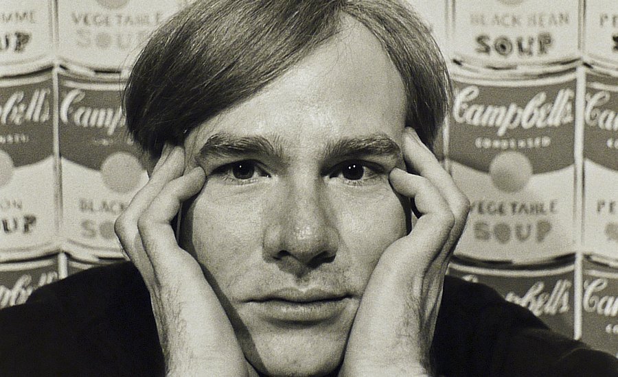
SELECTED ARTWORK: ANDY WARHOL, MARILYN DIPTYCH, 1962
|
Andy Warhol was born Andrew Warhola in 1928, in Pittsburgh, Pennsylvania, to Slovakian immigrants. They were not a family of means, but Warhol’s father recognized his son’s artistic talents at an early age and saved money, so he could attend college. Warhol graduated from art school at Pittsburgh’s Carnegie Institute of Technology in 1949, and then moved to New York, where he quickly garnered success as a commercial artist and illustrator. In the 1950s, Warhol’s drawings were displayed in department stores and published in Glamour, Vogue, and other popular magazines; he earned a reputation particularly for his whimsical illustrations of I. Miller brand shoes, and he developed a technique that combined drawing and printmaking to allow him to repeat an illustration as needed and make quick changes to suit clients’ needs. He had his first gallery exhibition in 1952, featuring illustrations for the writings of Truman Capote. Throughout the 1950s, Warhol explored homoerotic imagery, but did not find a broad audience for such work until later in the 1960s and ’70s, when homosexuality became increasingly accepted in the New York art world.
|
Warhol’s Early Career

Andy Warhol became a leading figure in the Pop art movement.
|
In the early 1960s, Warhol began making paintings in response to the Pop art movement, initiated in the 1950s in Britain by Richard Hamilton and the Independent Group. Coca-Cola 2 (1961), one of Warhol’s earliest forays into Pop art, shows his work in an important transitional stage. Anchoring the canvas is the image of an iconic glass Coke bottle, imprecisely hand-painted below part of the brand’s logo, and bracketed on both sides with passages of gestural brushstrokes that resemble AbEx painting. The work looks unfinished and messy—a tentative stab at bringing consumer products into dialogue with the hallmarks of modern painting. Within months, however, Warhol adopted a much more straightforward style, with crisp versions of the Coke bottle and logo occupying the entire canvas; he would go on, famously, to create brash, unvarnished paintings of Campbell’s soup cans, which he exhibited at the Ferus Gallery in Los Angeles for the first time in 1962 (initially resulting in very little critical or financial success). The boldness of Warhol’s approach had been influenced in part by his encounter with the work of Roy Lichtenstein, who had been experimenting with using images from comic strips as references for his paintings. Lichtenstein enlarged and altered cells from a strip and then hand-painted them onto canvas, along with the Ben- Day dot matrix pattern that had enabled the original images to be printed in the newspaper. Warhol had also made paintings based on comic book imagery, but turned to other subjects after seeing Lichtenstein’s work.

From left to right, gallery owner Leo Castelli, Pop art dealer Ivan Karp and artist Andy Warhol, all at Castelli's gallery in 1966. An early supporter of the artist, Castelli would be the subject of a silkscreen Warhol portrait wearing a business-like suit and tie. Credit: Sam Falk/The New York Times/Redux.
|
|
Warhol’s Factory
In 1962, Warhol substituted hand-painting with a silkscreen (or screen printing) process borrowed from commercial design, which allowed him to repeat an image many times, ad nauseum. The shift to silkscreen also enabled Warhol to assign a growing fleet of assistants the task of making the actual work, following his designs, which expanded from soup cans and Coke bottles to include reproduced photographs of disasters, race riots, criminals, flowers, and cows. He also made three-dimensional facsimile versions of commercial packing cartons, most famously the brightly colored red-white-and-blue box used by the Brillo company, which made pads for scouring dirty dishes.
From 1962 onward, Warhol referred to his studio as “The Factory,” reflecting the industrial means of reproduction and labor he utilized to create his work. Renaissance artists had often employed many assistants in workshops to carry out orders for patrons, but Warhol took the relationship between art and commerce and made it more literal, an integral part of his artistic practice reflected both in his working methods and in the kinds of images and objects he produced. The Factory was a symptom of the diminishing importance of the artist’s hand in the production of artworks, a feature that had previously been granted almost mystical qualities and on which the value of singular artworks often rested. Warhol’s Factory rejected the need for the “artist’s touch” and embraced the possibilities of reproducible media instead, allowing Warhol to make more art and distribute it more widely. Methods of reproduction also resulted in artworks that not only bore the image of consumer products, but in fact resembled store-bought items in their serialized production. In that way, Warhol, perhaps more so than any of his fellow Pop artists, was able to mimic in his art the production of images and goods in popular culture.

Marilyn Monroe died in August 1962, having overdosed on barbiturates. In the following four months, Warhol made more than twenty silkscreen paintings of her, all based on the same publicity photograph from the 1953 film Niagara. Warhol found in Monroe a fusion of two of his consistent themes: death and the cult of celebrity. By repeating the image, he evokes her ubiquitous presence in the media. The contrast of vivid colour with black and white, and the effect of fading in the right panel are suggestive of the star’s mortality.
Marilyn Diptych: Analysis
|
Warhol’s interests in consumerism, seriality, and reproducibility converged in his highly colorful silkscreened celebrity portraits. Marilyn Diptych, made in 1962, consists of two silver canvases onto which Warhol has screen printed a publicity photo of the actress Marilyn Monroe fifty times, twenty-five times in streaky grayscale and twenty-five times in a garish palette of acid yellow, purple, orange, and blue. The repetition of Monroe’s image mirrors its ubiquity in popular culture, where photographs of Monroe circulated rapidly in the mass media, especially in the wake of her tragic death, which had prompted Warhol to dedicate a series of paintings to her. Warhol heightens the real-world effects of repetition within the space of his two canvases, numbing viewers to the actress’s mask-like face. Despite this macabre description, Warhol was undeniably enraptured by celebrity culture (especially when tragedy was involved) and created a number of pseudo-celebrities himself, casting members of his entourage in underground films that garnered a cult following.
|
|
Although Warhol was undeniably charting new territory with his Pop paintings, he was also responding to various moments in art history. The gridded structure of Marilyn Diptych adds to the feeling that Monroe resembles an automaton, as grids tend to imply impersonal mechanical, mathematical, and permutational systems. In using the grid, Warhol nodded to the pioneers of abstract modern painting, notably Piet Mondrian, and also to more recent gridded paintings, sculptures, and objects by artists such as Sol LeWitt, Agnes Martin, and Ad Reinhardt, among others. Warhol also cleverly addresses the legacy of AbEx painting in Marilyn Diptych by creating a monumental picture blanketed with Monroe’s image, which achieves the “all-over” quality AbEx painters had sought earlier, without their overblown rhetoric.
Warhol, by contrast, was notoriously deadpan in his affect and favored irony over sincerity and conviction. Summing up his interest in the democratizing promise of using everyday, iconic images, Warhol said, “What’s great about this country is that America started the tradition where the richest consumers buy essentially the same things as the poorest. You can be watching TV and see Coca-Cola, and you know that the president drinks Coke, Liz Taylor drinks Coke, and just think, you can drink Coke too. A Coke is a Coke and no amount of money can get you a better Coke than the one the bum on the corner is drinking.”

SELECTED ARTWORK: NAM JUNE PAIK, ZEN FOR TV, 1963, 1976 VERSION
Paik’s Early Career
Nam June Paik was born in Seoul, Korea, in 1932. He trained as a classical pianist in Korea before he was forced to flee the Korean War with his family. They went first to Hong Kong and then settled in Japan, where Paik attended the University of Tokyo and completed a thesis on the influential German composer Arnold Schoenberg (who would later teach John Cage). Paik moved to West Germany after graduating and studied under two composers in Munich and Freiburg, though his most important connections would be made through the International Summer Courses for New Music in Darmstadt, where he met avant-garde composer Karlheinz Stockhausen one summer and Cage the next. In 1959, he debuted a work titled Hommage à John Cage, an audiotape that spliced together sound effects, screaming, talking, distorted music, and static. Shortly thereafter he decided to amplify the cacophonous sound he was exploring by adding live performance to the mix, and in 1962, he made the acquaintance of George Maciunas, the self- appointed “chairman” of a burgeoning international art movement called Fluxus, which offered a context for Paik to explore performance further.
After a number of years in Germany, Paik moved permanently to the United States in 1964. He maintained connections with Fluxus and continued performing, often with the cellist Charlotte Moorman. Almost immediately, however, he became most concerned with experimenting with new technologies and finding new ways to disseminate art. He is credited with having invented the genre of video art, a category which, in his oeuvre, encompassed everything from sculptural works made from stacked television sets to live broadcasts and feedback loops of musical performances.
|
Larger Context: Fluxus in West Germany
Fluxus was founded in 1961 by the Lithuanian-born artist George Maciunas, who had come to the United States in 1948. He inaugurated Fluxus in New York with a short-lived magazine, but developed it much further while stationed with the U.S. Air Force in Wiesbaden, West Germany, beginning in 1962. The name of the group was meant to allude to the fact that everything in the world is in flux and flow, which informed Maciunas’ emphasis on ephemeral, performance-based events such as concerts and festivals. Though Fluxus events often resembled Happenings in their chaotic, collaborative unfolding, and despite the fact that many artists participated in both Fluxus events and Happenings, Fluxus tended to attract more artists engaged with ideas originating in musical composition and performance, and it also, in Maciunas’s hands, had a more revolutionary anti-art ethos. Both forms of performance, however, often invoked everyday activities, sounds, and objects, from washing one’s hair to making a meal, and both often used a score or a set of instructions as the basis for the work of art—a work that could indeed be carried out by anyone, not just a professional artist.
|

|
|
Maciunas developed Fluxus into a network of international artists, which included, among many others, East Asian- born artists Yoko Ono, Ay-O, Shigeko Kubota, Mieko Shiomi; Americans George Brecht, Emmett Williams, Benjamin Patterson, Dick Higgins, and Alison Knowles; Germans such as Wolf Vostell and Joseph Beuys; and the French artists Ben Vautier and Robert Filliou. The group was notable for how international it was, and also for the fact that it included more women than any other art movement of the time. Each of the artists had different approaches to making art (or “anti-art,” as Fluxus espoused), but had similar conceptual and political aims, as encapsulated in Maciunas’ 1963 Fluxus Manifesto, which was “distributed” by being tossed into the crowd of a Fluxus concert. It read, in part, “Promote a revolutionary flood and tide in art. Promote living art, anti-art, promote NON ART REALITY to be fully grasped by all peoples, not only critics, dilettantes, and professionals.”
|

|
Zen for TV: Analysis

ZEN FOR TV
Nam June Paik, 1963, 1976 version
Manipulated vintage television and components, 19 x 22 1/2 x 18 in. (48.3 x 57.2 x 45.7 cm)

For the 1962 “Fluxus Festspiele neuester Musik” (Fluxus Festival of Recent Music), held in Wiesbaden, Germany, Paik performed a piece titled Zen for Head, which had first debuted in 1961 as part of Karlheinz Stockhausen’s concert piece Originale (Originals). Zen for Head was Paik’s interpretation of a 1960 score written by fellow Fluxus artist and composer LaMonte Young, which consisted of the following sentence: “Draw a straight line and follow it.” To fulfill the score, Paik laid out a scroll of paper on the ground, dunked his head and necktie into a bowl of black ink and tomato juice, and then dragged his inked head along the scroll of paper, creating a (mostly) straight line. In his adaptation of Young’s score, Paik gave the work a name that explicitly referenced East Asian spirituality and the tradition of calligraphy, nodding to his own roots and radicalizing the ephemerality that is often at the core of both Zen philosophy and the practice of calligraphy— both of which are features of everyday life in East Asia, made strange through Paik’s performance.
Paik transformed the concept of Zen for Head into other works, notably several variations of a work called Zen for TV, which he first created in 1963. Zen for TV consists of a (typically) small television displaying only a single line of light, running vertically or horizontally, mimicking the single line Paik created with his own body in Zen for Head. Paik made a number of copies of the work himself, sometimes using different television sets, but always manipulating the screen for the same result. The version pictured in your Art Reproductions Booklet was created in 1976, employing the same strategy that Paik had used for his first 1963 version. Bringing the instructional basis of Zen for Head full circle, Zen for TV has often been recreated using Paik’s diagram and instructions, which detailed how to tinker with the technology inside the television to render the screen into a single line. Many of Paik’s works from the 1960s onward used technology in innovative and creative ways, often turning technology on itself to create unexpected—and from an engineer’s perspective, undesired—effects.

